Shooting Retail and Merchandise Photos for Restaurant Brands
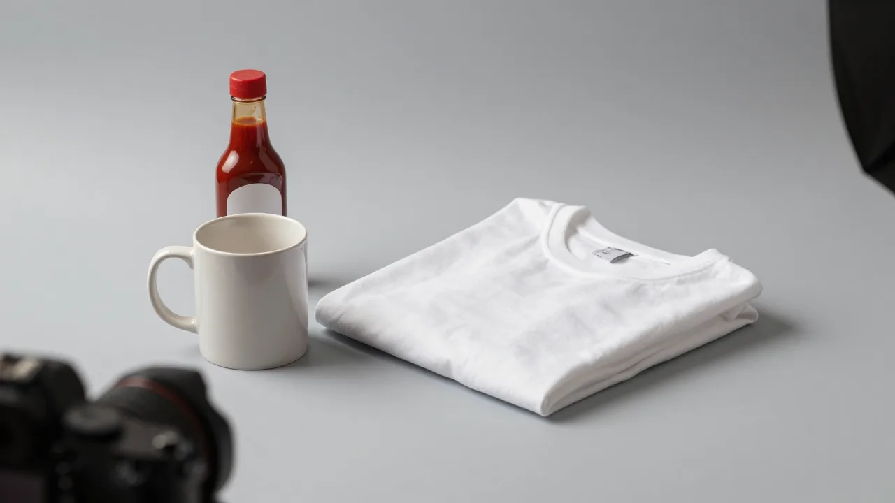
A bottle of your house hot sauce carries a 60% to 70% margin, ships in a flat-rate box, never goes bad on the shelf, and turns a customer into a walking billboard in their own kitchen. On paper it is the best product in the building. Then you look at the photo on your online store: the bottle sitting on the bar at closing time, shot under tungsten light, one corner of a napkin dispenser in frame, the label half in shadow.
That photo is why the sauce sells four units a week instead of forty.
Restaurant operators are usually good at food photography by the time they get into merch, and that competence works against them. Food photography and product photography have almost opposite goals. A dish photo creates desire -- it can be moody, cropped tight, atmospheric, ambiguous about portion size, and still work beautifully. A product photo has to inform before it can seduce. The shopper cannot pick the bottle up, cannot feel the shirt, cannot tell whether the mug is 8 ounces or 16. Every question the photo fails to answer is a reason not to buy.
The good news: product photography is more rule-bound than food photography, which means it is easier to get right. Follow the specs and even a phone shoot produces catalogue-grade results.
The Five Shots Every Merch Item Needs
Before touching a camera, decide what the set of images has to accomplish. For nearly every restaurant retail item, five frames cover it.
1. The clean hero
Product centered on a seamless white or light neutral background, even lighting, no props, no distractions, plenty of margin for cropping. This is the image that appears in your store grid, in marketplace listings, in search results, and in ads. It exists to be unambiguous, not artistic. Marketplaces frequently require a pure or near-pure white background, so shooting this frame properly makes every future listing painless.
2. The label or print detail
Close enough to read the type. For a sauce, that means the label and ingredient panel. For apparel, the print or embroidery texture. For a coffee bag, the roast information. Shoppers zoom on this shot more than any other, because it is where they verify the thing is real and well made.
3. The scale reference
The single most-skipped frame and the one that kills the most sales. Nothing in a clean product shot tells a viewer how big the item is. Put the bottle next to a hand, the mug next to a standard coffee pot, the tote on a shoulder. "Is this a 5 oz bottle or a 12 oz bottle" is a question that ends a purchase if the photo does not answer it.
4. The alternate angle
Back of the shirt, reverse of the label, top-down of the mug showing the interior glaze, the closure on a bag. This is a completeness signal as much as an information one -- listings with a single image read as low-effort regardless of how good that image is.
5. The lifestyle shot
The product in use, in your restaurant's world. The sauce bottle on a table next to the dish it belongs with. The tee on a real person, ideally a staff member, in the dining room. The tote on someone leaving with a takeout order. This is the frame that connects the merch back to the brand, and it is what performs on social. It is also the only one of the five where the standard food-photography instincts fully apply.
Catalogue-Grade Product Shots Without a Studio
KwickPhoto cleans backgrounds, corrects color casts, and normalizes exposure across a whole merch shoot, so a phone-shot bottle looks like it came from a product studio.
Try KwickPhoto FreeBuilding a Sweep: The Twenty-Dollar Studio
A seamless background -- a "sweep" -- is what makes product shots look professional. It is a single continuous surface that curves from horizontal to vertical with no visible seam or horizon line, so the product appears to float in clean space.
You can build one in ten minutes:
- A sheet of poster board or a roll of white paper, at least 22 by 28 inches for small items. Around $3 to $12.
- Two boxes or a wall to prop the back edge up. The paper should curve, not fold -- a crease shows up as a line in every shot.
- One large soft light source. A window is ideal. Position the product so the light comes from the side, roughly 45 degrees off the camera axis.
- A white bounce card on the shadow side. A piece of foam board or even a folded sheet of printer paper fills in the dark side and keeps detail visible.
- A tripod or a stack of books. Non-negotiable for a catalogue, because every item must be shot from the identical height and distance or the grid looks chaotic.
That is the entire kit. The reason it works is the same reason it works for food: a large, soft, directional light source flatters almost anything, while a small hard source creates harsh shadows and blown highlights. If you already own a diffuser and reflector from food shoots, you are done buying equipment. The prop discipline transfers too -- knowing which surfaces and objects support a subject rather than competing with it is exactly the skill covered in our food photography props guide.
Product-Specific Technique
Different merch categories fail in different ways. A few specifics save a lot of reshooting.
Bottles and jars (sauces, oils, spice blends)
Glass and liquid mean reflections. Shoot with the light to the side and slightly behind so the liquid glows and the label stays lit. Watch for your own reflection in the glass -- shoot from behind a piece of black card with a lens-sized hole cut in it if the bottle is very reflective. Level the camera with the middle of the label; shooting down at a bottle makes it look squat and distorts the type. Avoid the ultra-wide lens on a phone, which bows straight edges at close range.
Apparel (tees, hats, aprons)
Two approaches, and you want both. The flat lay -- garment pressed, folded consistently, shot from directly overhead -- gives you the clean catalogue image and shows the print undistorted. The worn shot shows drape and fit, which is the information a flat lay cannot deliver. Use real staff rather than models; for a restaurant brand, that authenticity is an asset, not a compromise. Always steam or press first. Wrinkles read as cheap merchandise.
Ceramics and drinkware
Mugs and tumblers photograph best at a slight angle, about 15 to 20 degrees above the rim, so the interior is partially visible and the handle reads clearly. Glazed surfaces catch highlights easily -- diffuse hard. Shoot the mug empty for the catalogue shot and filled for lifestyle, because a filled mug hides the interior finish some shoppers care about.
Packaged goods (coffee, spice tins, cookie boxes)
Front panel square to the camera for the hero. Then shoot the packaging as an object -- corners, texture, closures, the tactile qualities that justify the price. If the packaging is part of the brand promise, photograph it like it matters, because the unboxing is the customer's actual first experience of the product. Our main-site piece on packaging as a branding surface makes the case that this is a design decision long before it is a photography one.
Gift sets and bundles
Arrange with a clear visual hierarchy -- one dominant item, supporting items stepped down in size around it. Shoot from a slightly elevated angle so nothing hides behind anything else. Bundles are the most-returned merch category when photos are unclear about exactly what is included, so include an overhead flat lay showing every component separated and countable.
Example scenario: a 40-seat Oaxacan restaurant reshooting its house salsas
Illustrative scenario — a composite example built to show how the numbers work. It does not describe a real business or customer.
Consider a 40-seat Oaxacan restaurant in Austin with an online shop selling two house salsas, a spice blend, and a tee. The salsas are the whole reason the shop exists, and in 2025 they average six online units a week.
One photo per product. Just the bottle on the bar, taken on a phone after close because that is when there is time. It seems fine. It is a bottle. What else is there to show?
The problems are specific. Under warm bar lighting the red salsa photographs brownish-orange, so the color is wrong on the one attribute customers judge a salsa by. There is no scale reference, and the support inbox regularly gets asked whether the bottle is the little one or the big one. And with no label close-up, the ingredient panel -- which lists three chiles most customers have never heard of, and which is genuinely part of the pitch -- is invisible.
Suppose that in January 2026 the owner spends about ninety minutes on a Sunday building a paper sweep on a two-top by the front window and shooting all four products, five frames each.
The scale shot is the surprise. Just a hand holding the bottle. Questions about size drop to basically zero, and those were maybe half the emails coming in.
She corrects the color through KwickPhoto so the salsa reads as the deep brick red it actually is, then rebuilds the shop listings with the full five-image set. Over the following quarter in this example, online salsa units rise from about six a week to twenty-two, and the tee -- previously nearly dormant -- starts selling once there is a photo of a line cook actually wearing it.
Same product, same price, same shipping. The shop finally shows people what they are buying.
Color Accuracy Matters More Than It Does for Food
Here is a difference worth internalizing. If a dish photo runs slightly warm, it usually looks better -- warmth reads as appetizing. If a product photo runs slightly warm, it is now inaccurate, and inaccuracy on a physical product generates returns and complaints.
A shopper who receives a "burgundy" tee that is visibly maroon in daylight will say the photo was misleading, and they will be right. So for merch:
- Set white balance deliberately. Shoot a plain white sheet of paper in the same light and use it to correct, or use your phone's manual white balance if available.
- Avoid mixed lighting. Window light plus overhead tungsten produces a color cast that varies across the frame and cannot be fixed with a single adjustment. Kill the room lights.
- Check against the real object. Hold the product next to the screen. If they disagree, the screen is wrong.
- Do not saturate. The instinct honed on food photography -- push the reds, deepen the greens -- is actively harmful here.
Specs, Consistency, and Where the Photos Go
Product images end up in more places than dish photos do, and each destination has its own expectations. Shoot once, export many:
- Square, at least 1600 by 1600 pixels, for store grids and most marketplace listings. Square is the safest default because it survives nearly every template.
- 4:5 vertical for social feeds, where vertical claims more screen.
- 16:9 horizontal for banners, email headers, and website sections.
- Consistent product size within the frame across the entire catalogue. If the mug fills 70% of the frame height, the bottle should too. Nothing makes a store page look more amateur than products rendered at wildly different apparent scales.
- Identical background and lighting across every item, which is why you shoot the whole catalogue in one session rather than adding items ad hoc over months.
That last point is the operational key. Merch catalogues drift because a new item gets added in June and shot in whatever conditions were available that day. Book one session, shoot everything, and when a new product launches, rebuild the same sweep in the same spot with the same settings. Write the settings down.
Once the images are live, merch listings are unusually easy to test, because the traffic is concentrated on a handful of product pages. Swapping a hero image and watching conversion over two weeks is a clean experiment -- the same methodology we describe for A/B testing restaurant photos. And since merch is often the highest-margin thing you sell, the payoff per point of conversion is unusually large. If you are still building the case internally for a retail line at all, our main-site analysis of merchandise as a restaurant revenue stream covers the economics.
Mistakes That Make Merch Look Cheap
- Shooting on the bar after close. Wrong light, wrong background, wrong color. It is the single most common merch photo and the worst.
- No scale reference. Guarantees size questions and abandoned carts.
- Wrinkled apparel. Press everything. It takes four minutes and doubles the perceived quality.
- Inconsistent product scale across the catalogue. Makes a store page look assembled rather than designed.
- Over-editing. Saturated, contrast-boosted product photos misrepresent the item and generate returns.
- Cropping the hero too tight. Marketplaces re-crop. Leave margin.
- Forgetting the lifestyle frame. Without it, merch is just an object; with it, merch is a piece of your restaurant somebody gets to take home. That frame is also what actually travels on social media.
The Bottom Line
Restaurant merchandise fails online for a boring reason: it gets photographed like food when it needs to be photographed like a product. The shopper is trying to answer practical questions -- how big, what color, what material, what does the label say -- and a moody, tightly cropped, warm-toned bar shot answers none of them.
Build a paper sweep by a window for under twenty dollars. Shoot five frames per item: clean hero, label detail, scale reference, alternate angle, lifestyle. Fix your white balance so the color is true. Keep the product size consistent across the catalogue, and export square, vertical, and horizontal crops from one master. Do that in a single ninety-minute session and your highest-margin products will finally look worth what you charge for them.
Sell Retail Alongside the Menu
KwickPhoto is part of KwickOS, the all-in-one platform for restaurants. Run merchandise, gift cards, and menu items through one system -- with one consistent image library behind all of them.
Get Started at KwickOS.comFrequently Asked Questions
How is merchandise photography different from food photography?
Food photography sells appetite; product photography sells information. A merch shopper cannot pick the item up, so the photo has to answer size, color, material, and finish before it does anything stylish. That means a clean background, even lighting, an accurate color, and at least one shot that shows scale.
What background should I use for restaurant merchandise photos?
A seamless white or light neutral sweep for the main catalogue shots, because most e-commerce and marketplace templates expect it and it keeps colors accurate. Use branded or textured backgrounds only for secondary lifestyle images, where atmosphere matters more than technical clarity.
How many photos does each merch item need?
Five is a good working minimum: a clean hero on white, a detail shot of the label or print, a scale shot with a familiar object or a person, a back or alternate angle, and one lifestyle image in context. Apparel usually needs one more -- the flat lay plus a worn shot.
Can I shoot restaurant merch on a phone?
Yes, for almost every product a restaurant sells. Use a tripod so framing stays identical across the catalogue, shoot near a large window with a diffuser, set white balance manually or correct it in editing, and avoid the ultra-wide lens, which distorts bottles and mugs at close range.
Do merchandise photos really affect sales?
They are the main variable. Retail items have no server describing them and no aroma doing the persuading, so the photograph carries the entire pitch. Products with a clean hero image, a legible label shot, and a visible scale reference consistently convert better than the same product shown in a single dim snapshot.